For premium estate agents and developers
- High quality ‘flambient’ internal and external photography
- Engaging, cinematic video
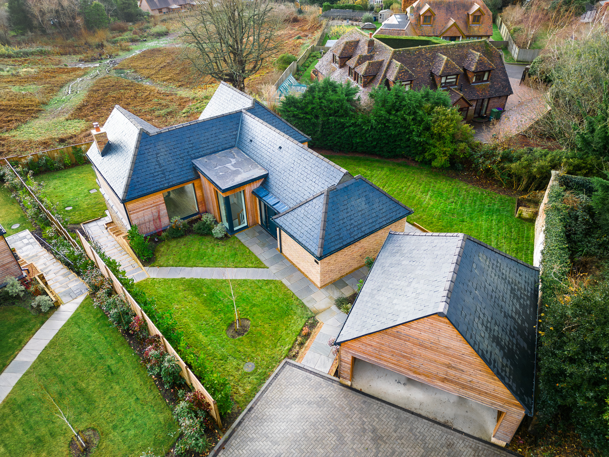
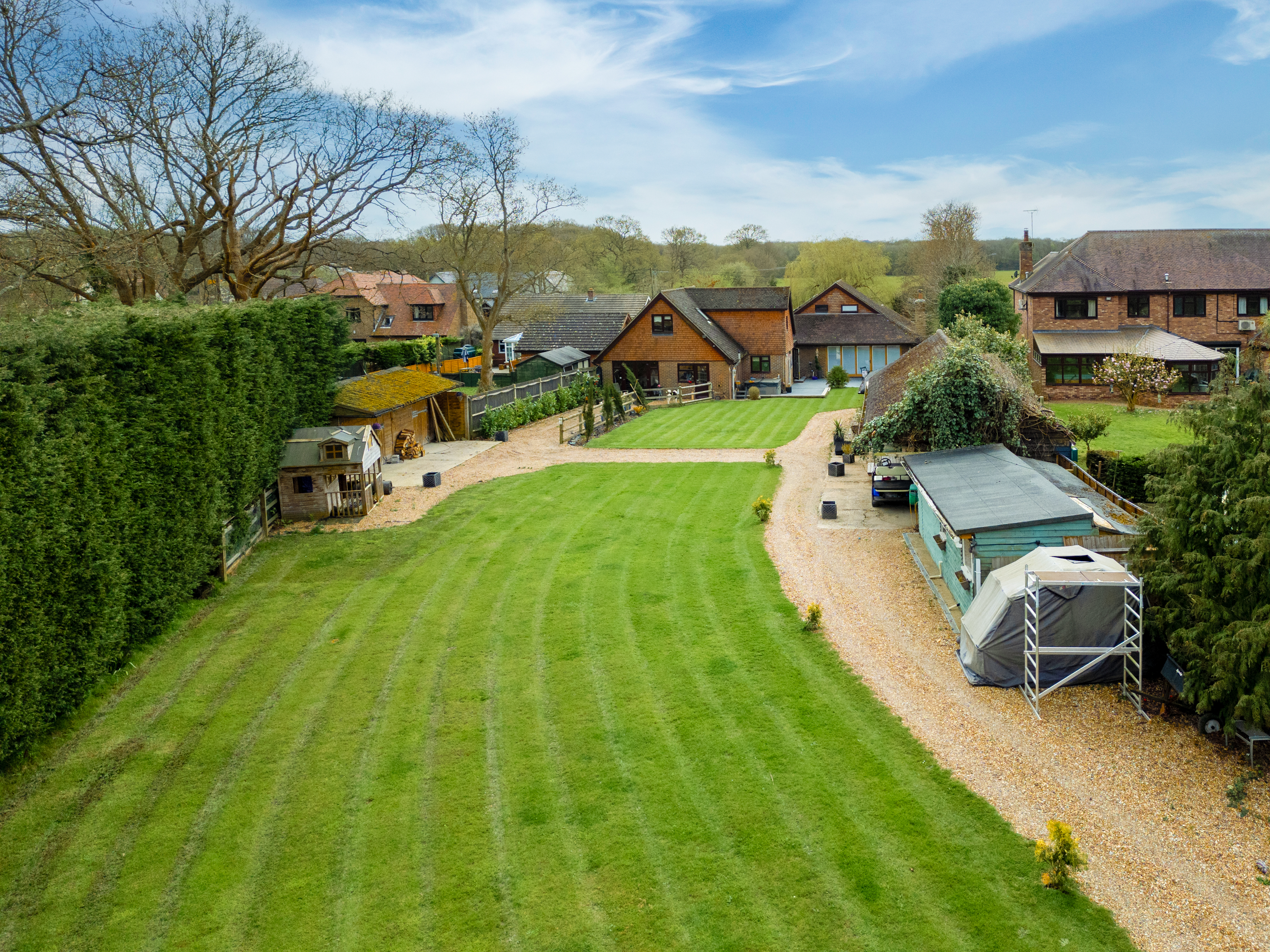
- Aerial drone photography and video
- Flexible pricing
Our approach
We are not selling properties, we are marketing your estate agency.
The right home at the right price will sell regardless of the photos. I get it! By providing top-level property photography we don’t expect to dramatically increase selling prices – instead we are representing your estate agency as – hopefully – one of the best in the business. With truly excellent photographs and video your listings represent YOU, and by standing out you will attract more, high-value vendors.
‘The vendors aren’t willing to pay’. Take it from me, many are and I know because we work directly with them. Their to-be former home, their development project, their investment – for them it deserves to be shown online in its absolute best light and the relatively low cost of premium photography and videography is almost a no-brainer. For some, just the peace of mind that the photos are the best available is important. When you can offer prospective vendors a top level media package they can feel reassured that they’re with the best possible estate agent who truly cares about their sale – you.
Photographers are weird. Yes, I hear you, I meet a few others. (Videographers are even worse!) And we’re entering people’s homes and walking around taking photographs, representing YOU. So, while telling you that I’m such a great, friendly guy would seem like a huge red flag, I’ll tell you how I behave on a shoot. Firstly, I carry a box of little blue booties that go on over my shoes without fail. I am unfailingly polite and respectful to vendors when working around them, and imagine they’re in the room with me even when they’re not. If it seems appropriate I’ll communicate with them to let them know where I’ll be and for how long, and I don’t mind having a conversation with them at all. I have moved around, worked in a few different industries, I can talk to most people. However, if people just want the photos done as quickly as possible and for me to get out of their house, that suits me too.
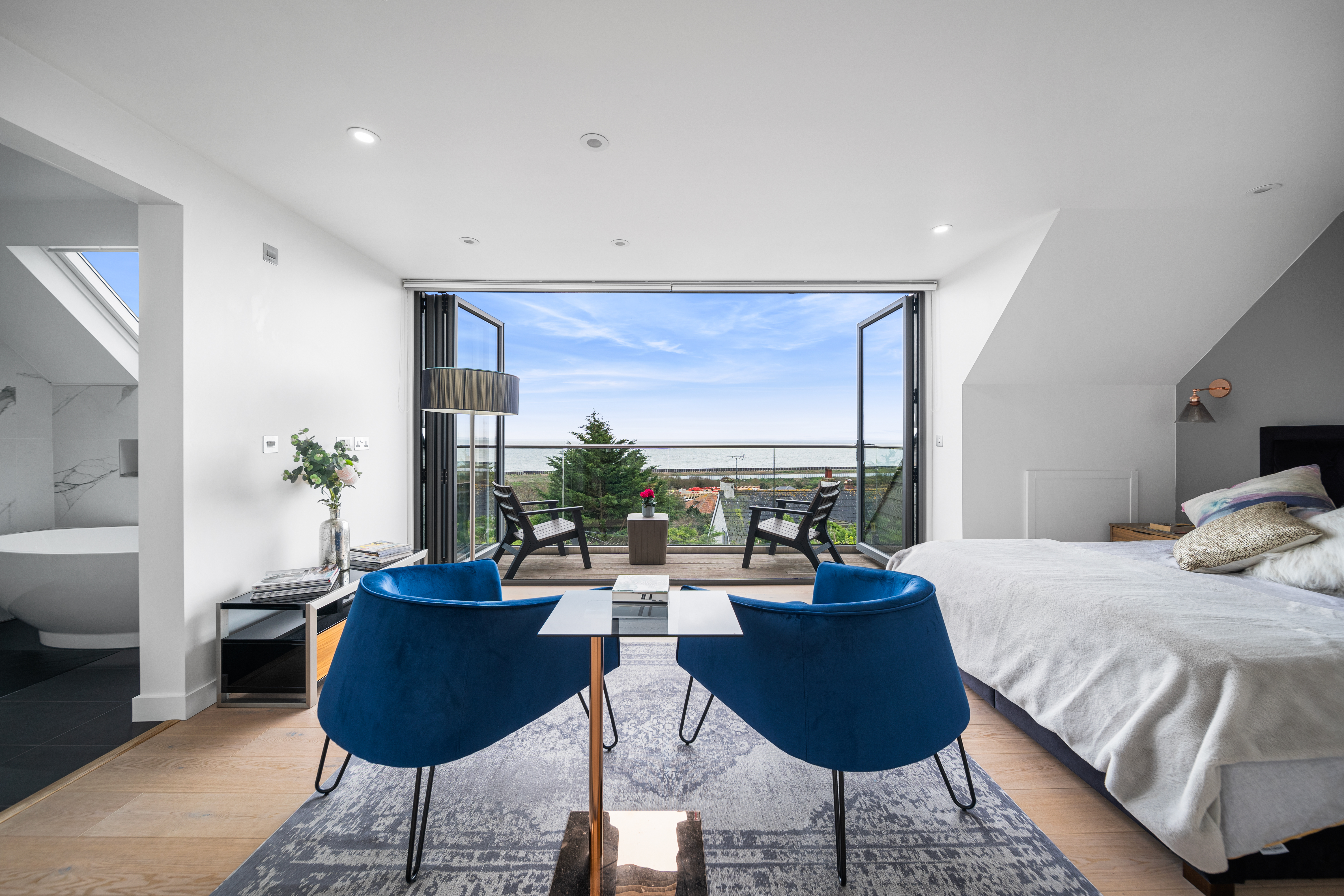
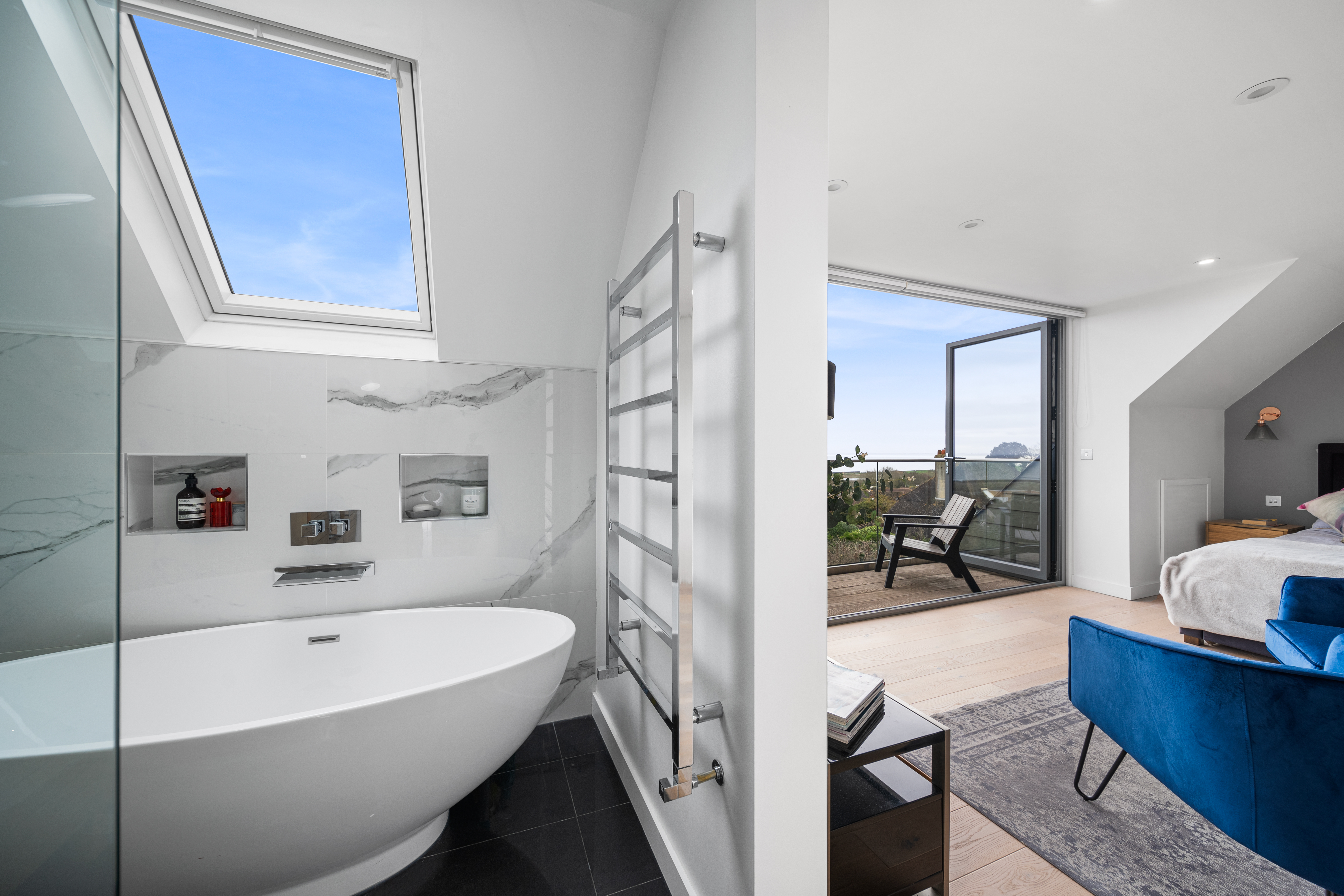
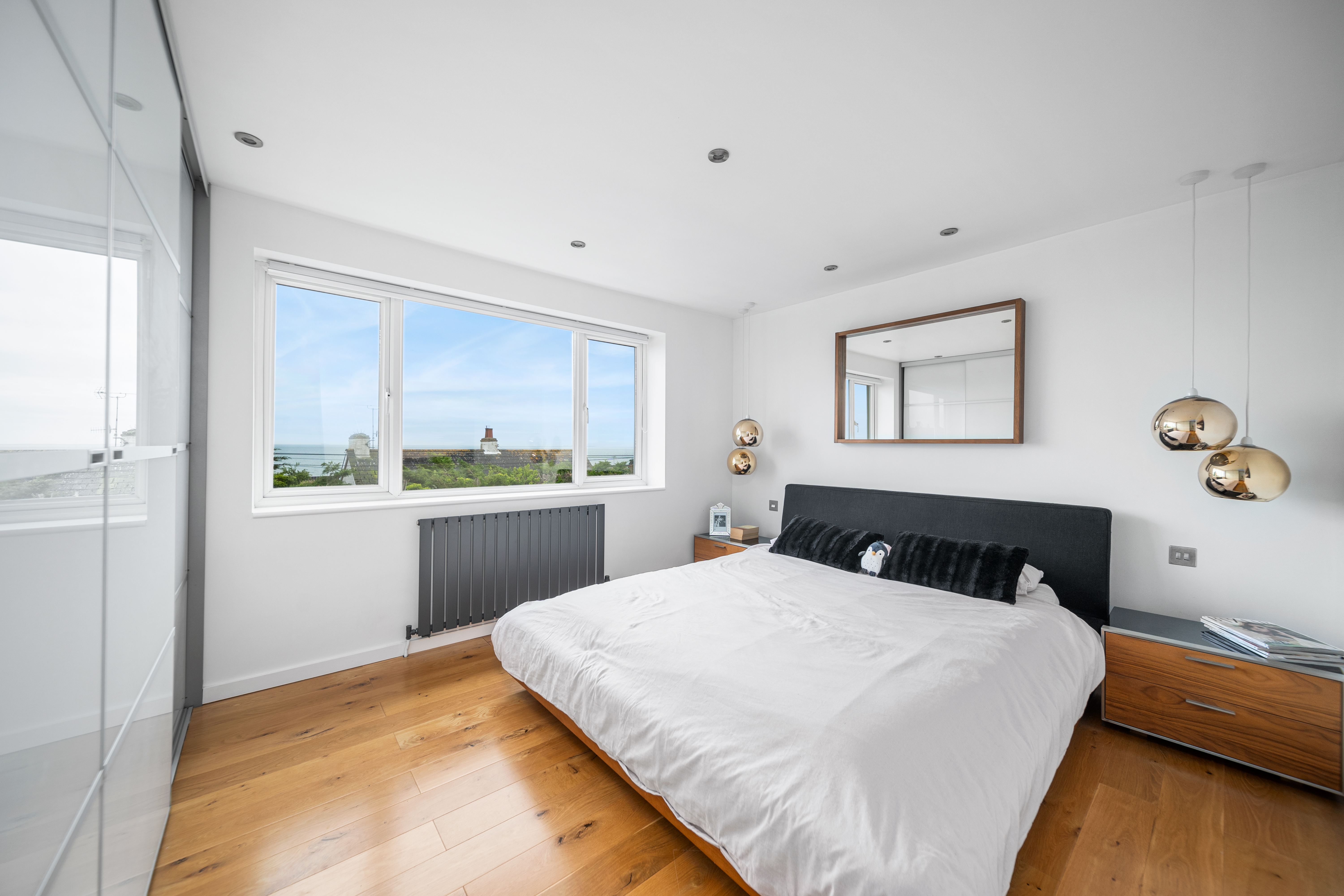
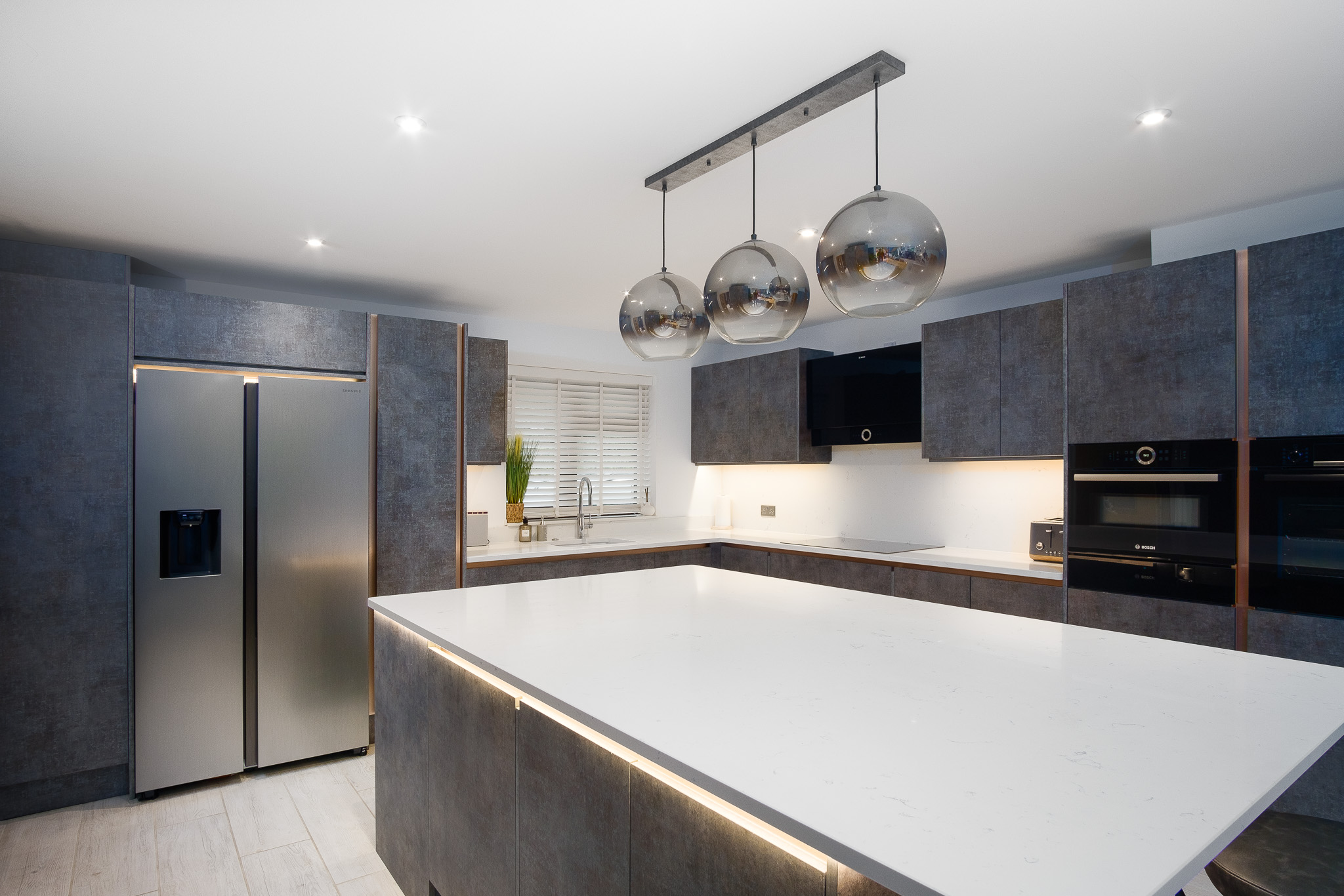
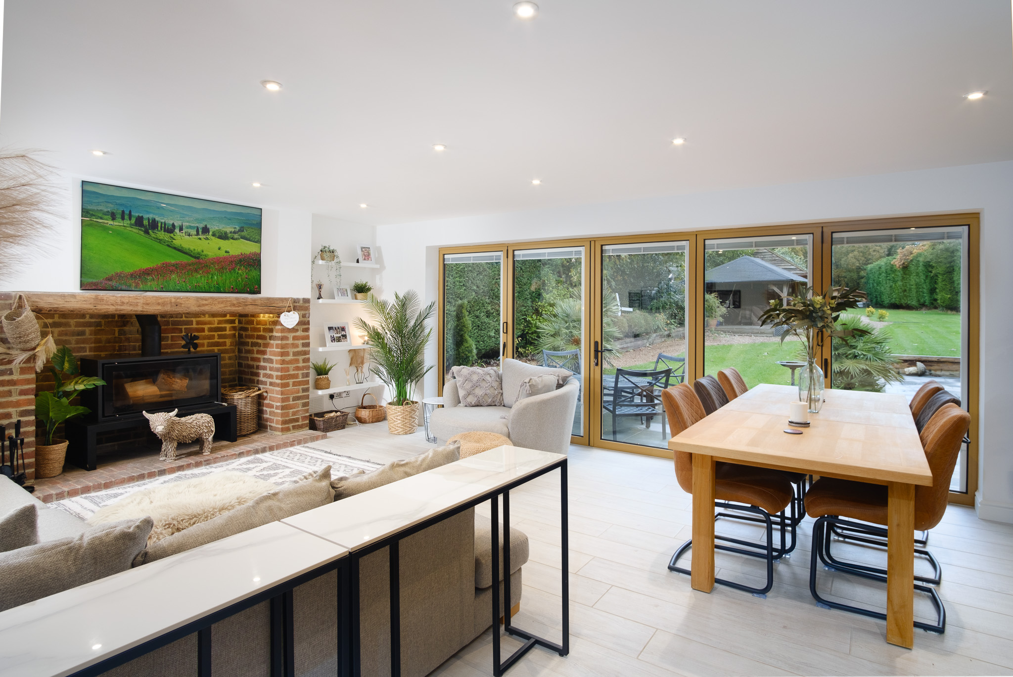
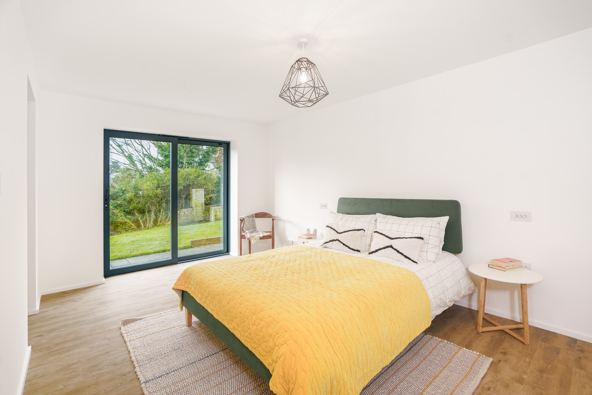
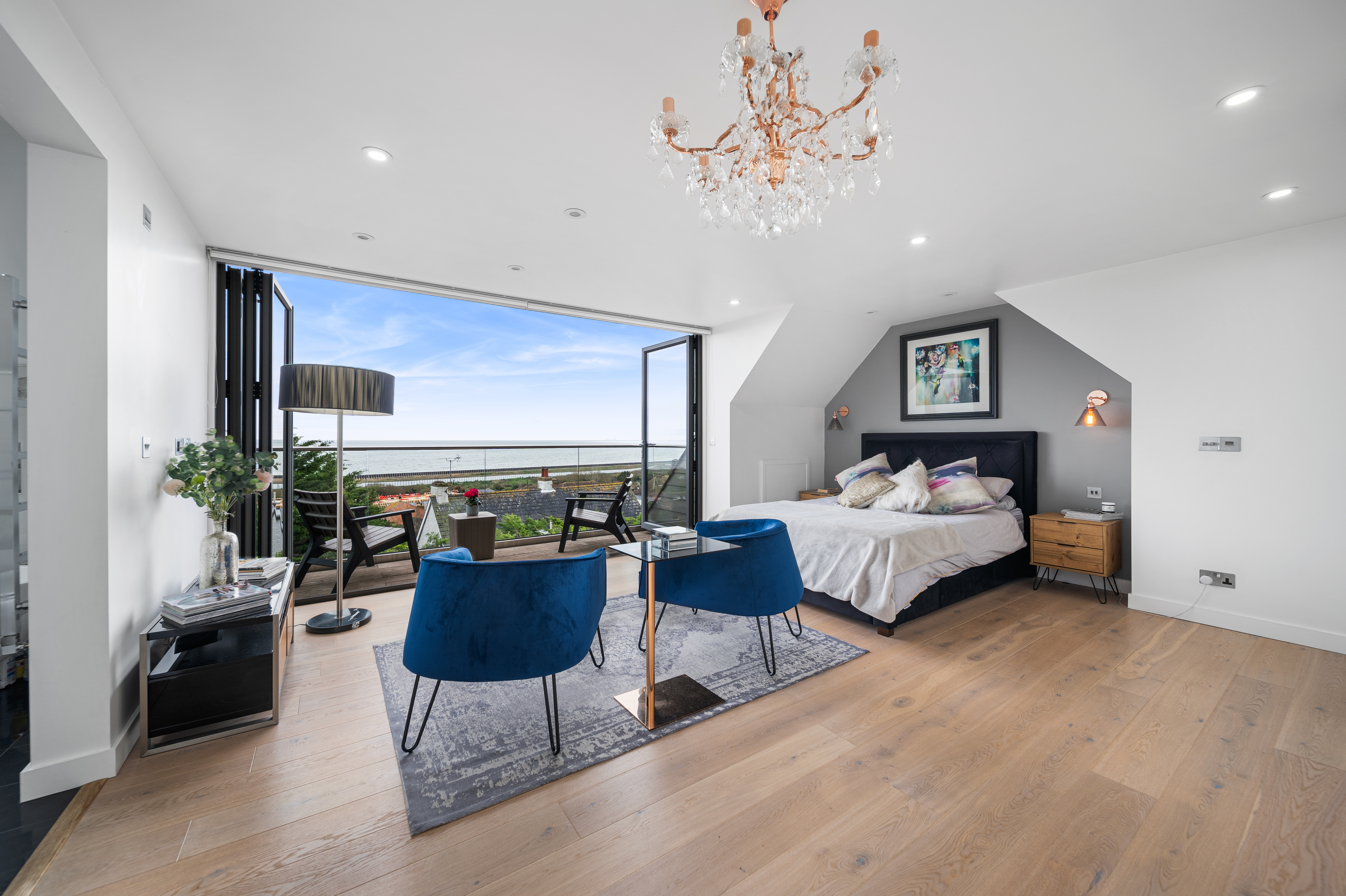
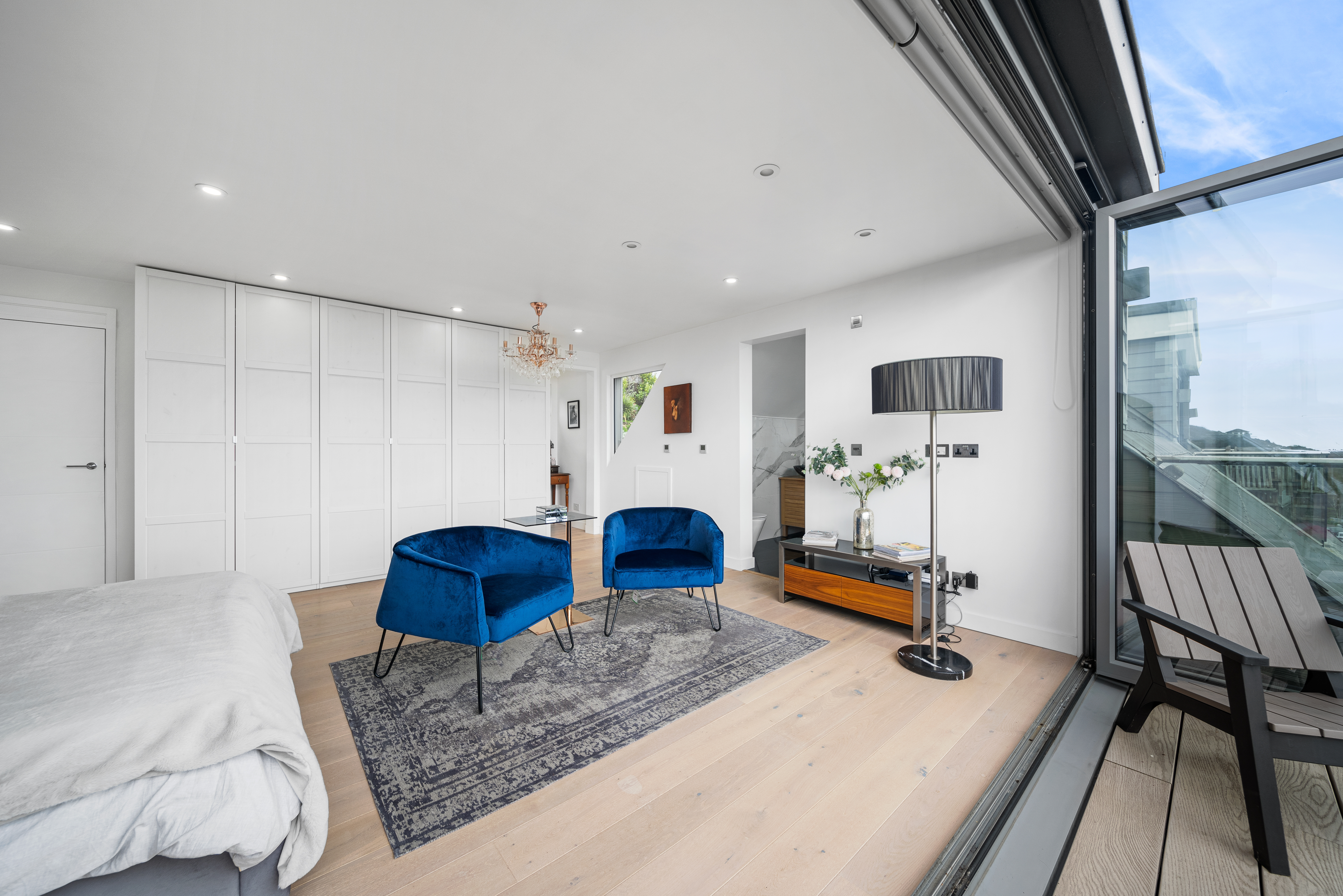
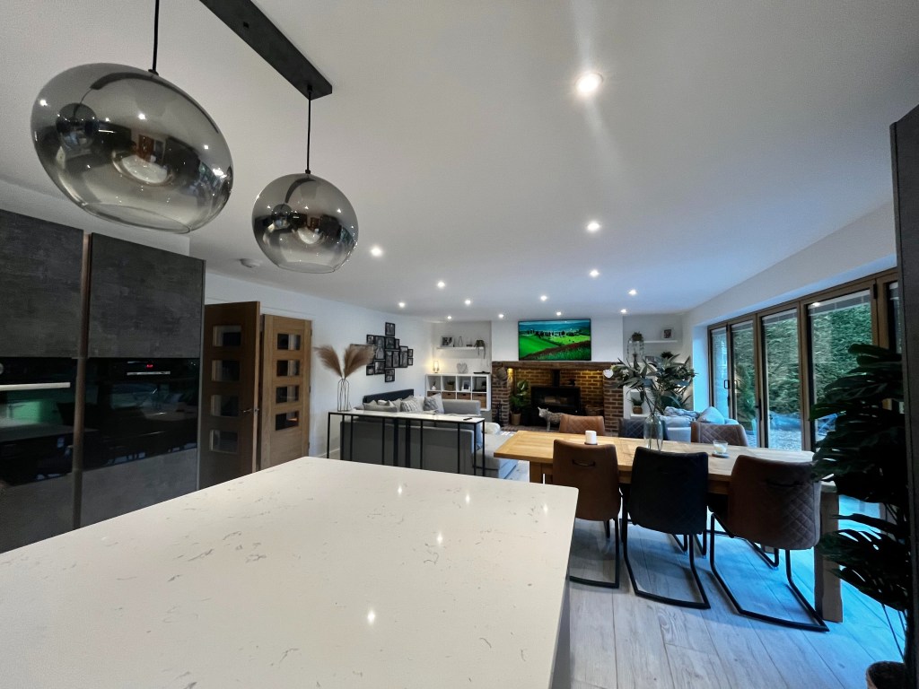
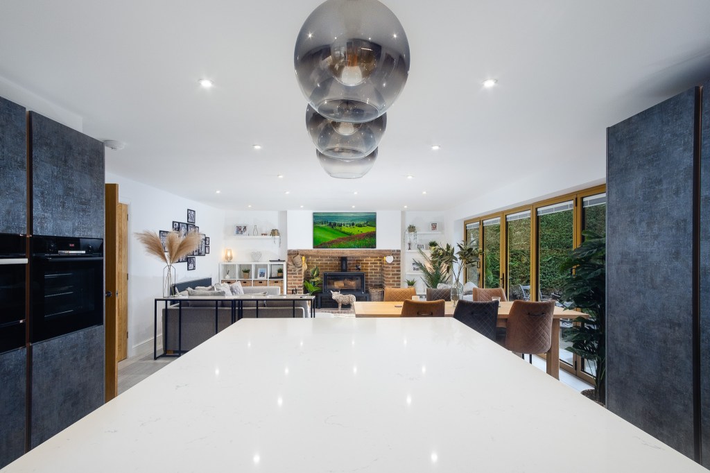
Here at Wright & Oistad we provide a comprehensive solution for property marketing. Accurate, flattering photographs that show each room in its best light, high resolution aerial/drone photography, AND beautiful, engaging video that creates an exciting sense of each property and sets your listings apart.
Our technical approach to internal photography is well suited to luxury developments and special properties, but we do cover the whole range of residential and commercial property, with reflective pricing.
Our dynamic videos draw inspiration from the vibrant US real estate market, moving seamlessly between interior and exterior and providing a modern, premium feel to each listing and helping properties – and agents – stand out in the competitive UK luxury home marketplace.
We can also discuss drone work, floor plans and 3D tours, all delivered quickly, accurately, with minimum fuss.
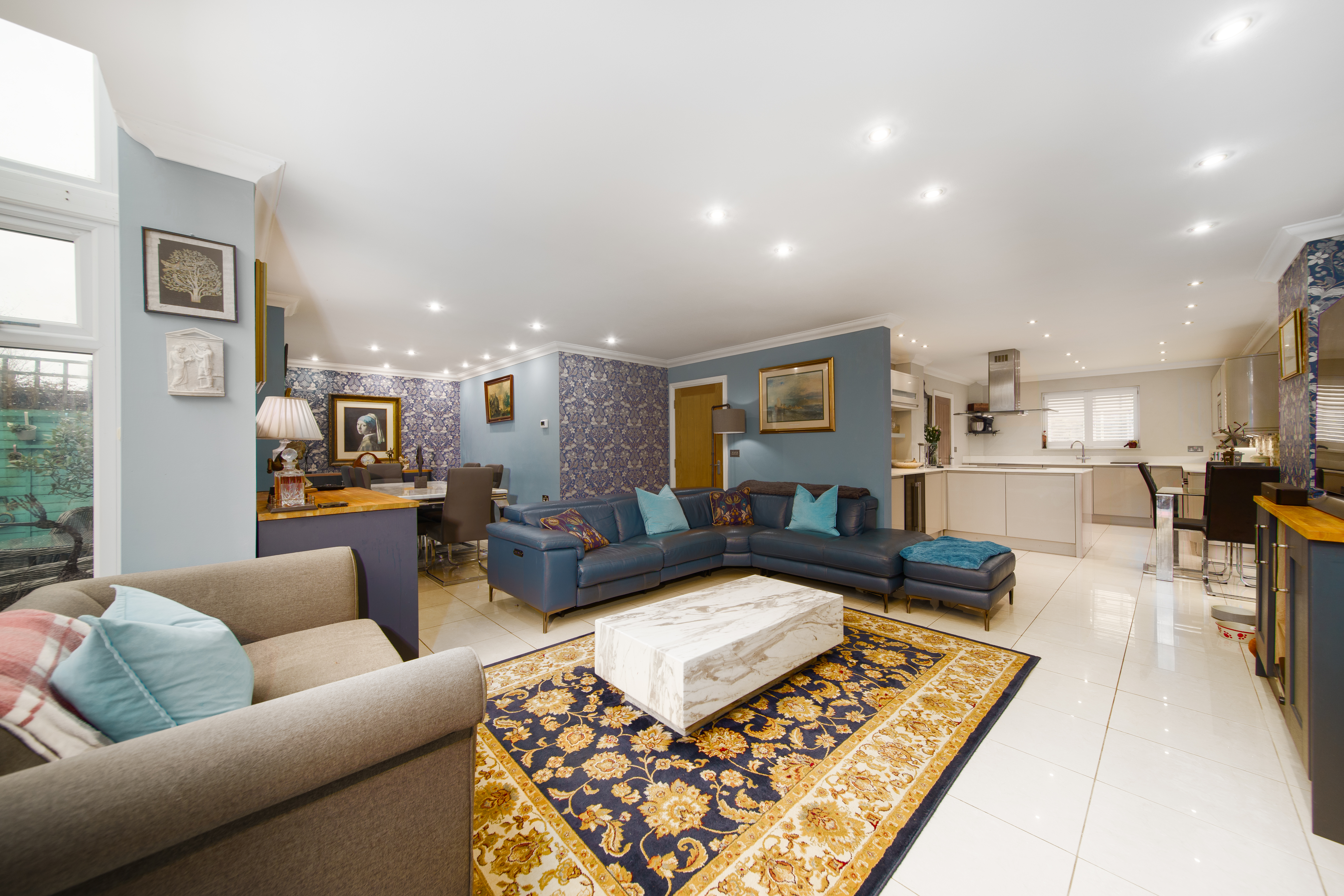
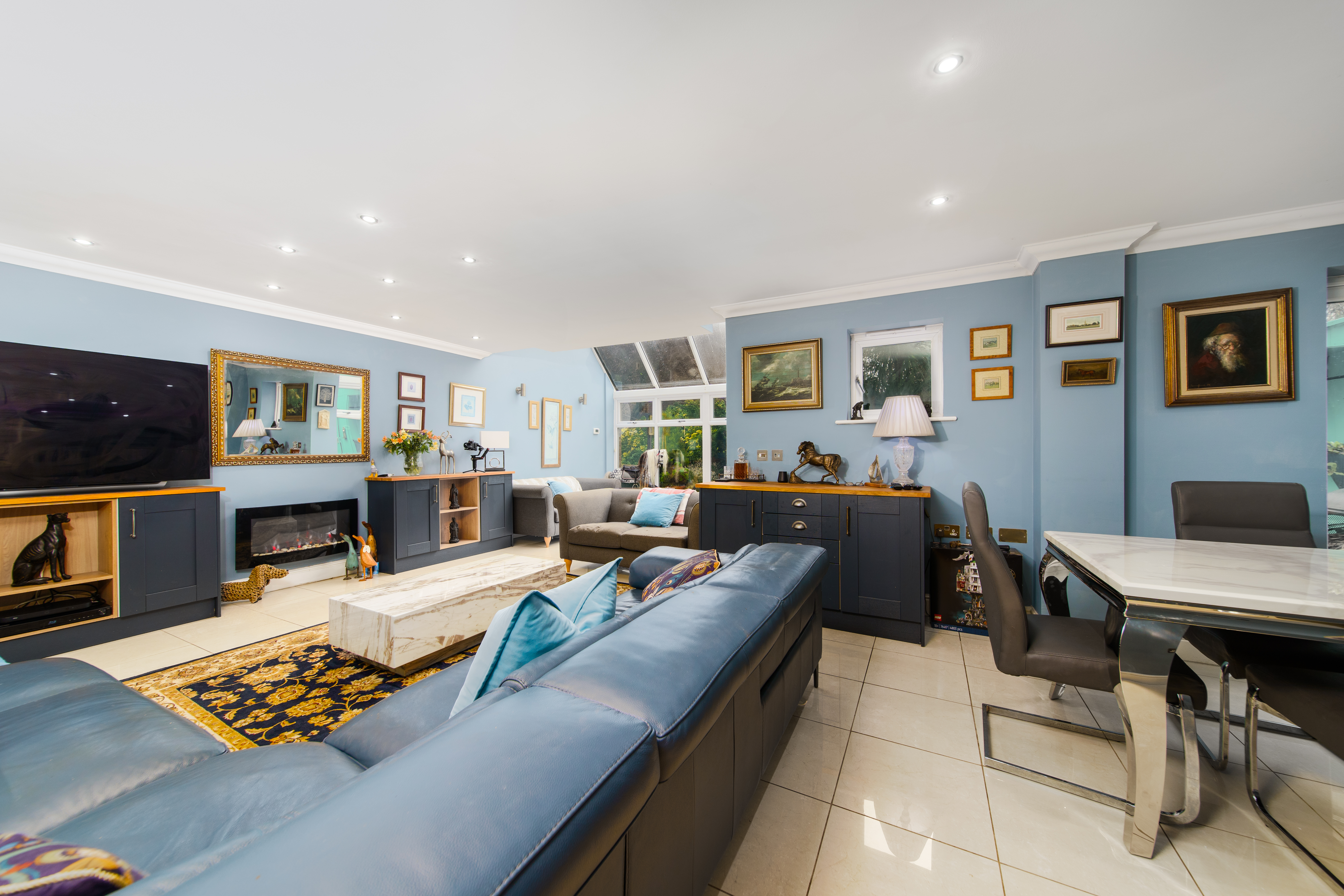
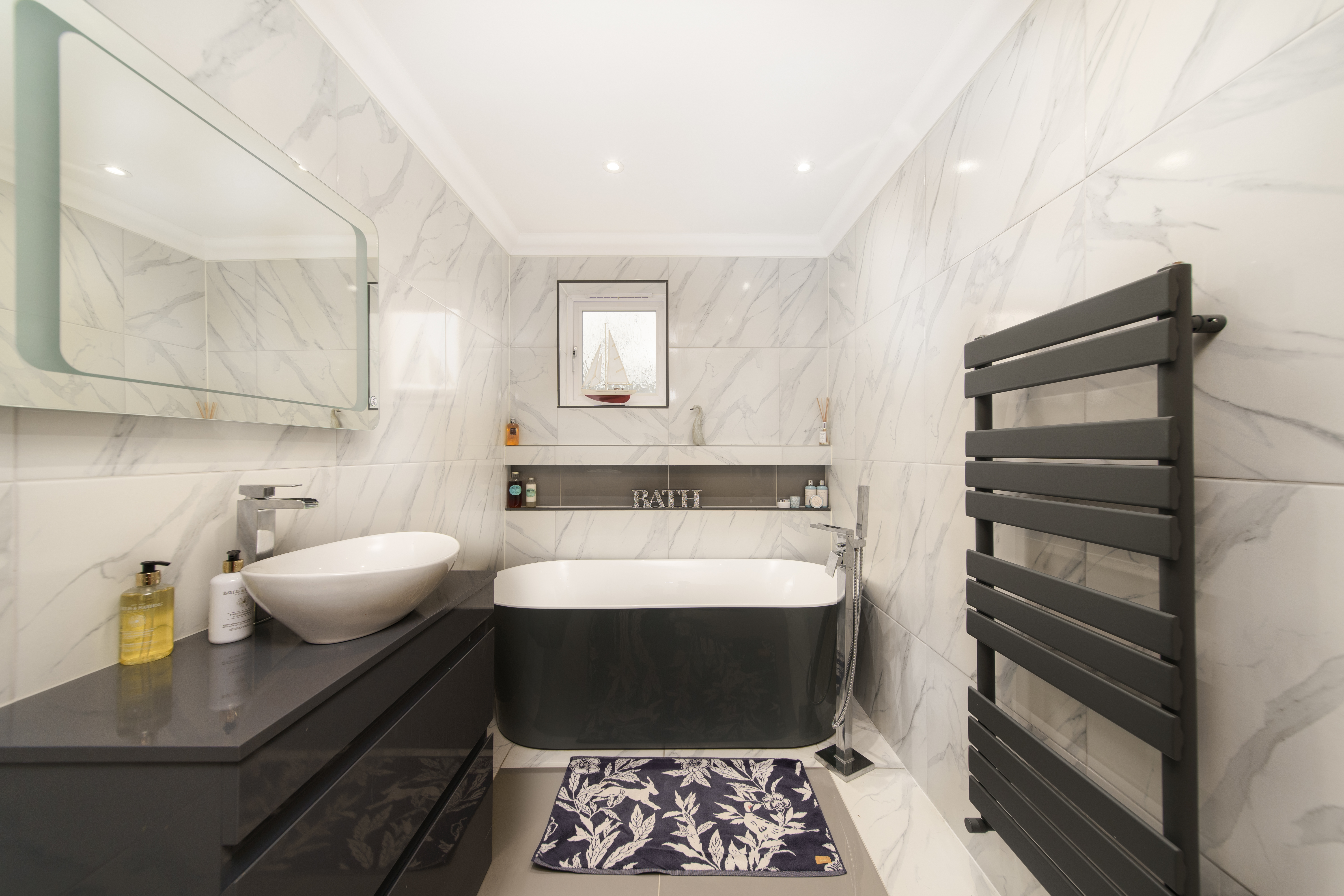
Recent work:


Spot THe DIFFERENce!
We shot a house at the same time as an agent took photos using their phone. Here’s how they compare:
Agent photo (iPhone)
Dull and murky, with blue light spilling in from outside onto the floor, and an unbalanced, awkward composition. Uncontrolled light flares on the ceiling are distracting and while not too problematic here, can cause problems in other situations. The light fixture is very distorted overall it looks cluttered.
Our photo (flash/ambient blend)
Taken within an hour of the agent photo, whites are white rather than beige and the room feels spacious (as it was). The patio doorframes and garden outside are bold and colourful. The kitchen units are much closer to their real colour which does contain blue and the structure of the room is arguable more clearly illustrated with the symmetrical composition.

Agent photo (iPhone)
The super-wide angle lens of the phone cheapens this immaculate kitchen and actually makes it look smaller. The lighting is yellowy and and the units have lost their blue colour, both diminishing the impact of what is a truly lovely design. An object is left on the table and the lens flares on the ceiling add to a veritable Mardi Gras of colour on what should be a pristine white ceiling. The side of the unit on the left is in view which isn’t ideal and the verticals are way off.

Our photo
This composition is more balanced, showing a realistic relationship between the island table and the kitchen units. The beautiful blue hue of the units is represented well, the ceiling is white, the floor neutral and the framing draws attention to the high end refrigerator and ovens. The carefully designed lighting under the table, behind the refrigerator, and around the hob are nicely shown – something even the latest phones won’t manage. Also important: notice the difference in feel of having straight vertical lines.
We took interior photographs of this modest flat to replace the photos the owner had taken, having failed to sell. It was not redecorated between photos.
Owner photo
The floor is unnaturally orange, and there are murky colours on the bannisters, ceiling and walls. The rug looks dirty. The vertical lines of the door and shelves are distorted and plunge inwards.
Our photo
Colours are accurate and pleasant, natural light is well represented giving a bright and airy feeling. Vertical lines are vertical, and although the shot actually shows less of the hall than the owner’s photo, it actually feels bigger.
Owner photo
The walls have weird colours (presumably they’ve been edited because they were too bright), leaving a patchy appearance and unpleasant colours. There’s no clear distinction between wall colour and ceiling colour, the carpet looks grimy despite being new, and the sofa appears stretched. The overall feeling is a bit grim.
Our photo
The ceiling and walls are much more colour-accurate thanks to the flash/ambient technique we offer, so the ceiling is actually white! The carpet appears new and the furniture is not distractingly distorted. You can also see something of the outside, rather than a blown-out window and our framing shows that the room is actually L-shaped and much larger. Also, we turned the lights on!
Owner photo
The amount of light coming through the window is not only making the window appear a pure white, blown-out mess, but the shadows are harsh and the colours are all over the place. The carpet – again, new – looks bad, and the ceilings look low because of the composition. Somehow this pleasant room feels a bit bleak.
Our photo
By overpowering the sun with a powerful flash we’re able to get control of the light to give us proper colours and a great view of the (real) blue sky outside. The room also looks larger because we’ve got a good balance of floor and ceiling, unlike the owner’s photo.
Let’s talk about windows.
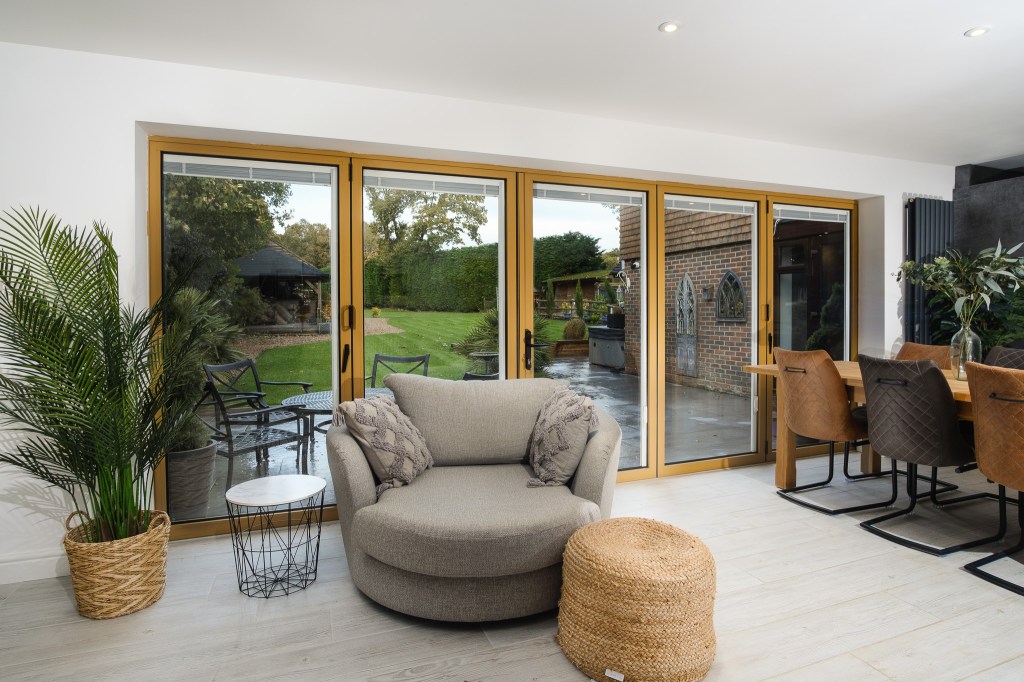
Sometimes the view from a window is a key selling point for a room but often the light outside is so much brighter than inside that it’s hard to photograph it well. HDR mode in phone cameras SORT OF solves this problem, but it’s still a phone photo so there’s a big compromise in image quality. Here’s a photo using ambient light (ie no flash) and exposing the photo to show the outside and the inside as best we can. You’ve seen lots of photos like this, maybe from your existing photographer:
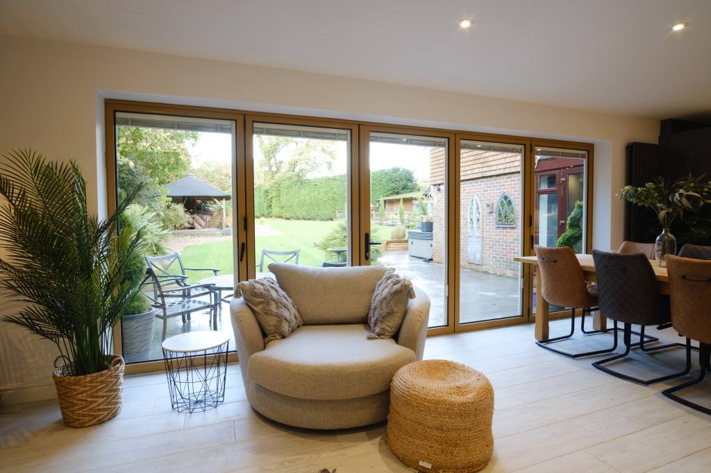
The outside is a bit too bright, the inside is a bit too dark, and the colours are off. It’s all a bit yellow because the light we’re getting from the overheads and the window are… yellow. To get accurate colours, we can use a ‘daylight’ coloured (ie white) flash, and that looks like this:
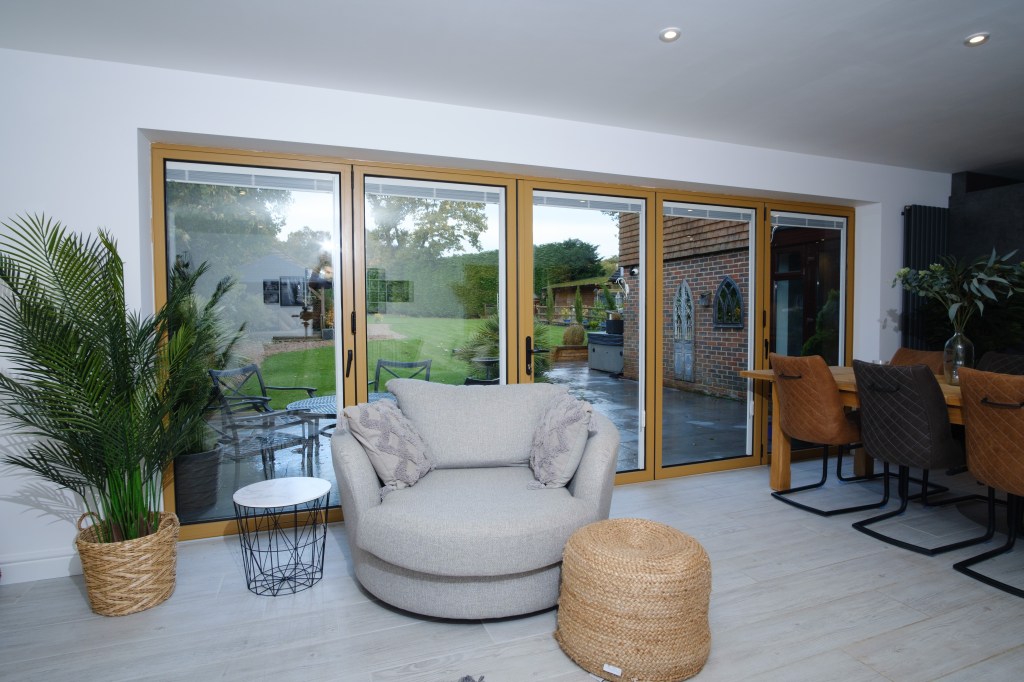
Now our whites are white and the colours look more correct, but the far end is a bit dark, there’s a flash reflection in the patio door and we have quite harsh shadows giving it a bit of a bleak look. Let’s take another photo and flash the far end:

We’ll also flash the windows a couple of times – here’s one of those:
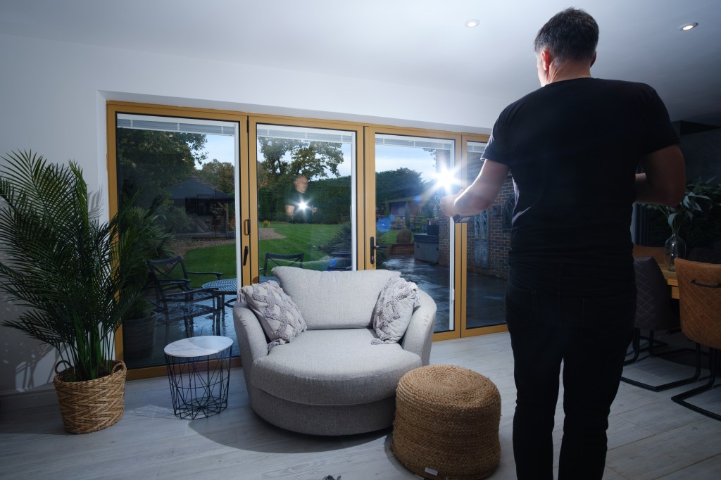
Ok. When we get back to the studio we’re going to combine these. We’ll use the light information – but NOT the colour information – from the ambient photo. We’ll overlay that onto our flash photos which give us natural colours. This will give us a natural feel of how the light works in the room: coming through the window, shining off the floor and furniture, and shining from light fixtures. It feels… natural.

For the window, we have a photo or two where both the window frames AND the outdoors are both are nicely exposed and we can just brush that in using a special blending mode. There’s no need to cut around the frames, plant or furniture that can give weird haloing and hazy effects and takes a long time.
This technique – known as ‘flambient’ is currently the only way to get images of this quality that are natural-looking and show through windows in such a beautiful way.
